Artist Spotlight: Nick Perry

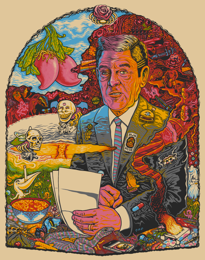
“Primate Disciple”
Nick and I met in December of 2014 at a holiday party in Lawrence, Kansas. I had just graduated from university and my immediate mission was finding a source of income while keeping my hopes alive of becoming a writer. In the beginning of our collaboration and friendship, we both found common ground in that struggle—paying bills, not wishing to become deadbeat artists.
At the party, Nick and I quickly became friends. We shared encyclopedic memories of Kansas Basketball, Royals baseball, and Chiefs football. We toured subjects ranging from craft beer to muenster cheese (of which Nick’s interest was two-fold: its actual taste and a niche reference to the classic sitcom, The Munsters). Eventually, we talked art. I said I was an aspiring writer. Nick said he was a graphic designer, and my ears perked up when he disclosed his passion for drawing.
“Have you illustrated any comic books?” I asked. He said that he had, actually.
The following week, we met at my apartment to talk business (and drink IPAs). Keep in mind I had yet to see any of Nick’s work but was already imagining the potential. The next iconic pairing of writer and illustrator. Nick and I, teaming up like Alan Moore and Dave Gibbons (The Watchmen). I told him that my vision wasn’t for him to illustrate my work but to illustrate our work. My sales pitch to Nick was that our undefined project would be a joint effort in which he could assist the writing, and in turn, I could influence his illustrations. To me, the most inspired collaborative efforts came from trust and shared responsibility.
At that time, Nick had already branded himself as Red Legger Studio—illustrator and screen printer extraordinaire. He had shown his work at galleries, designed event posters for local businesses, and drawn a concert poster for the band Split Lip Rayfield. Nick is as easygoing a person you could hope to cross paths with, but I was somewhat intimidated by his drawing ability, not to mention his vetted standing in the local arts scene. Compared to Nick, I had no artistic prominence.
We left that meeting deciding to move forward with a comic book project. I don’t think we knew that five years later, we would still be working on it. But the fact that our passion project is still in development doesn’t strain our friendship. We still meet up to discuss the project. But mostly we talk sports, throw darts, and drink beers while vinyl records spin in the background. Music from singers like Bob Dylan or John Prine, folk heroes who populate Nick’s sketchbook (or who are framed on my living room wall, courtesy of Red Legger Studio).
It’s hard to remember not knowing what to expect from a Nick Perry illustration. Today, my house is peppered with his art: specifically, his renderings of our favorite sports teams. And yet, he still manages to find ways to surprise me; whether he’s designing pages for our comic book or screen printing in preparation for a showing at a gallery, his work is always fresh and appealing, thought-provoking and accessible. Nick’s work reminds me of an unlikely collision between a Charles Burns’s comic book and a spiritual succession to Bosch’s Garden of Earthly Delights. His illustrations highlight symbols of American mythology and play on national nostalgia. The result is a representation of chaos between the immediate impacts of historical events and the lingering footprint still visible in society today—Abolition, the Cold War, Reaganomics, etc.
In February of this year, I was working for Porter House Review and our staff was preparing for a showing at AWP. Our merchandise was in need of an update. So I reached out to Nick. He immediately went to work in his sketchbook and within days sent us a catalog of promising designs. Again, my friend had surprised me. I gave him no direction to run with. We, as a journal, just wanted to see what he came up with. Now, we couldn’t be happier with his efforts.
Nick told me he referenced hand-painted signs and grocery ads from the early twentieth century as inspiration for his Porter House Review designs. Such styles frequently show up in his work. Whether he’s designing pages for yearbooks, screen printing original drawings, or working on commissioned jobs, he finds a way to weave in influences that inspire him to keep making art. His style is his own. It’s uniquely representative of Nick and the way he views the world: full of life and story in every corner.
—William Pellett
Check out our interview with Nick Perry here.
Selected Original Designs
Designs for Porter House Review


